- Home
- Frontend Development
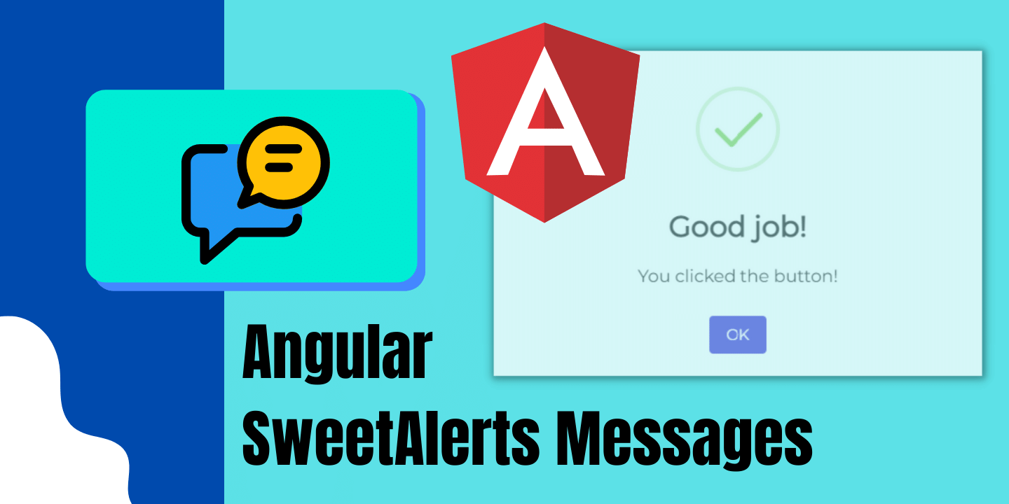
- How to Add SweetAlerts in Angu ...
Hey developers! In this article, we are going to learn how to add SweetAlerts in Angular project. For those of you who don’t know SweetAlert is an open-source library that has a very modern UI for showing angular alerts or notifications on a website.
SweetAlert Library has quite a few alert message design and alert javascript function. And in this article, we are going to implement a few of them. But to check out all its various layouts, visit SweetAlert2 documentation here. So, without further ado, let’s begin.
Prerequisites
- Angular project should be up and running. (Create Angular Project)
Table of Content
- What is SweetAlert?
- Import SweetAlert Library in Angular
- Create a child component for SweetAlert Layouts
What is SweetAlert?
Sweetalert is an opensource library which is very popular and used by many frontend websites and web-apps. As mentioned in the official website “A BEAUTIFUL, RESPONSIVE, CUSTOMIZABLE, ACCESSIBLE (WAI-ARIA) REPLACEMENT FOR JAVASCRIPT’S POPUP BOXES”
Simply put, it’s a javascript alert messages library that’s free to use. It has a beautiful alert message design and its various alert javascript function allows us to make angular alert popup quite complex as well. As you would see in the below examples. Comparison pictures of normal javascript alert messages vs Sweetalert angular alert box are shown below:
Normal JavaScript Alert Messages

SweetAlert: Angular Alert Box

Angular Alert Popup: Import SweetAlert Library in Angular
Earlier we saw how much SweetAlert brings a modernistic UI to the Angular alert popup. So, let’s implement it. Open your angular project and install the npm package for Sweetalert by executing the following command in the terminal.
npm install sweetalert2
With this, Sweetalert2 for Angular alert message would be accessible in your Angular project. In the next step, we will see how to use them on our webpage.
Angular Alert: Creating Sweet Alert Message Design
Next, we need to create multiple angular alert dialog designs for SweetAlert. For this, we need to create a child component in Angular named “Alertmsg”. Execute the following code to create it:
ng g c Alertmsg
In this component, we will add multiple Sweetalert layouts. And will trigger each alert with a click of a button. Hence, open the “alertmsg.component.html” file in Angular and copy the following code in it:
					<div>
    <div>
        <h2>Angular Sweetalert - Programatically</h2>
    </div>
</div>
<div style="padding: 5px; margin: 5px;">
    <button style="margin-right: 10px;margin-left: 10px;" (click)="simpleAlert()">Basic Alert Msg</button>
    <button style="margin-right: 10px;margin-left: 10px;" (click)="alertWithSuccess()">Alert with Success</button>
    <button style="margin-right: 10px;margin-left: 10px;" (click)="confirmBox()">Confirm Box</button>
    <button style="margin-right: 10px;margin-left: 10px;" (click)="erroalert()">Error Alert</button>
    <button style="margin-right: 10px;margin-left: 10px;" (click)="topend()">Corner Alert Msg</button>
    <button style="margin-right: 10px;margin-left: 10px;" (click)="ajax_request()">Fetch GitHub Avatar</button>
</div>
With the above code, we have completed the design part for our SweetAlert Angular alert popup. Now let’s move on to the logical part. Go to the “alertmsg.component.ts” file in Angular. Now, import the SweetAlert library in this component by adding the following import statement at the top.
import Swal from 'sweetalert2';
Afterwards, in the same “alertmsg.component.ts” file, add the following code:
					export class AlertmsgComponent implements OnInit {
  constructor() {}

  ngOnInit(): void {}

  simpleAlert() {
    Swal.fire('Welcome to Programatically');
  }

  alertWithSuccess() {
    Swal.fire('Thank you...', 'You submitted successfully!', 'success');
  }
  erroalert() {
    Swal.fire({
      icon: 'error',
      title: 'Oops...',
      text: 'Something went wrong!',
      footer: '<a href>Why do I have this issue?</a>',
    });
  }
  topend() {
    Swal.fire({
      position: 'top-end',
      icon: 'success',
      title: 'Your work has been saved',
      showConfirmButton: false,
      timer: 1500,
    });
  }
  confirmBox() {
    Swal.fire({
      title: 'Are you sure?',
      text: "You won't be able to revert this!",
      icon: 'warning',
      showCancelButton: true,
      confirmButtonText: 'Yes, delete it!',
      cancelButtonText: 'No, cancel!',
    }).then((result) => {
      if (result.value) {
        Swal.fire(
          'Deleted!',
          'Your imaginary file has been deleted.',
          'success'
        );
      } else if (result.dismiss === Swal.DismissReason.cancel) {
        Swal.fire('Cancelled', 'Your imaginary file is safe :)', 'error');
      }
    });
  }

  ajax_request() {
    Swal.fire({
      title: 'Submit your Github username',
      input: 'text',
      inputAttributes: {
        autocapitalize: 'off',
      },
      showCancelButton: true,
      confirmButtonText: 'Look up',
      showLoaderOnConfirm: true,
      preConfirm: (login) => {
        return fetch(`//api.github.com/users/${login}`)
          .then((response) => {
            if (!response.ok) {
              throw new Error(response.statusText);
            }
            return response.json();
          })
          .catch((error) => {
            Swal.showValidationMessage(`Request failed: ${error}`);
          });
      },
      allowOutsideClick: () => !Swal.isLoading(),
    }).then((result) => {
      if (result.isConfirmed) {
        Swal.fire({
          title: `${result.value.login}'s avatar`,
          imageUrl: result.value.avatar_url,
        });
      }
    });
  }
SweetAlert Popup: Add Angular Alert Message Layouts to Parent Component
Lastly, we need to add the selector tag script of the child component into the app component. This will allow all the Angular alert message designs inside the child component to appear in the app component. And hence become visible on the frontend.
If you have named the child component the same way as I have in the previous step, then simply copy the following selector tag and paste it into the “app.component.html” file. But if you have named it differently, then you will find the selector tag in the child’s “component.ts” file.
<app-alertmsg></app-alertmsg>
Now simply run your angular project with the following command in the terminal:
ng serve
The following output should be visible on the web page. Each click of a button will show a different UI of the SweetAlert popup, as displayed in the images below:


And that’s a wrap!
I hope this tutorial helped you learn how to add sweetalerts in angular project. You may also want to learn to open a component in another component as a modal in angular or how to create a dropdown in angular. Feel free to leave a review in the comment section below.
Have a great one!
GitHub Repository
Recent Comments
Categories
- Angular
- AWS
- Backend Development
- Big Data
- Cloud
- Database
- Deployment
- DevOps
- Docker
- Frontend Development
- GitHub
- Google Cloud Platform
- Installations
- Java
- JavaScript
- Linux
- MySQL
- Networking
- NodeJS
- Python
- Python Flask
- Report
- Security
- Server
- SpringBoot
- Subdomain
- TypeScript
- Uncategorized
- VSCode
- Webhosting
- WordPress
Search
Recent Post

Understanding Linux Scheduling Algorithm: A Comprehensive Guide
- 13 June, 2023
- 3 min read

How to add routing in Angular
- 9 May, 2023
- 4 min read
What is Data at Rest in Cloud
- 13 March, 2023
- 2 min read
Featured Videos
All Tags
Amazon Web Services
Angular
API
AWS
Bash
Bash Scripting
Big Data
Cloud Server
Cluster
Command Line
CRUD
Database
Deployment
DevOps
Docker
Elementor
GitHub
Google Cloud
Google Cloud Platform
HBase Database
Header
installation
JasperReport
Java
JavaScript
Linux
Local Server
MySQL
NodeJS
npm
Programming
Publish
Puppeteer
Python
S3 Bucket
Security
SpringBoot
SSH
Terminal
ternary operators
TypeScript
Virtual Machines
Webhosting
Windows
WordPress